
CSS Layouts: Flexbox vs. Grid - The Best Tools for Web Design
Flexbox vs. Grid: Mastering CSS Layouts for Modern Web Design


Introduction
When designing modern web layouts, CSS Flexbox and CSS Grid are two powerful tools that can simplify the process and give you greater control over your design. Each tool has its unique strengths, and knowing when and how to use them is essential for creating responsive, aesthetically pleasing layouts. In this blog, we’ll explore the basics of Flexbox and Grid, and provide a simple example to compare the two.
Understanding Flexbox: Aligning and Distributing Items Easily
Flexbox is a one-dimensional layout system in CSS, meaning it helps you align items either in a row (horizontal) or a column (vertical). It's ideal for smaller components or items within a container where the layout direction is straightforward.
Key Concepts:
Flex Container: The parent element that holds flex items. It’s defined by setting
display: flexordisplay: inline-flex.Flex Items: The children of a flex container, which are automatically treated as flexible items. They adjust in size and position based on available space.
Justify Content: Aligns items horizontally within the container (left, center, right, space-between, etc.).
Align Items: Aligns items vertically within the container (top, middle, bottom).
Flex Direction: Defines whether the items are placed in a row (default) or column.
Example: Simple Two-Column Layout with Flexbox
.container {
  display: flex;
  justify-content: space-between; /* Align items horizontally */
  align-items: stretch; /* Align items vertically */
}

.item {
  flex: 1; /* Make each item take up equal space */
  margin: 10px;
}
<div class="container">
  <div class="item">Column 1</div>
  <div class="item">Column 2</div>
</div>

In this example, the two items within the .container will be evenly spaced and stretched across the available width, thanks to Flexbox.
CSS Grid Basics: Creating Complex Layouts with Ease
CSS Grid, on the other hand, is a two-dimensional layout system, meaning it allows you to design both rows and columns simultaneously. This makes it perfect for complex layouts where both horizontal and vertical alignment is crucial.
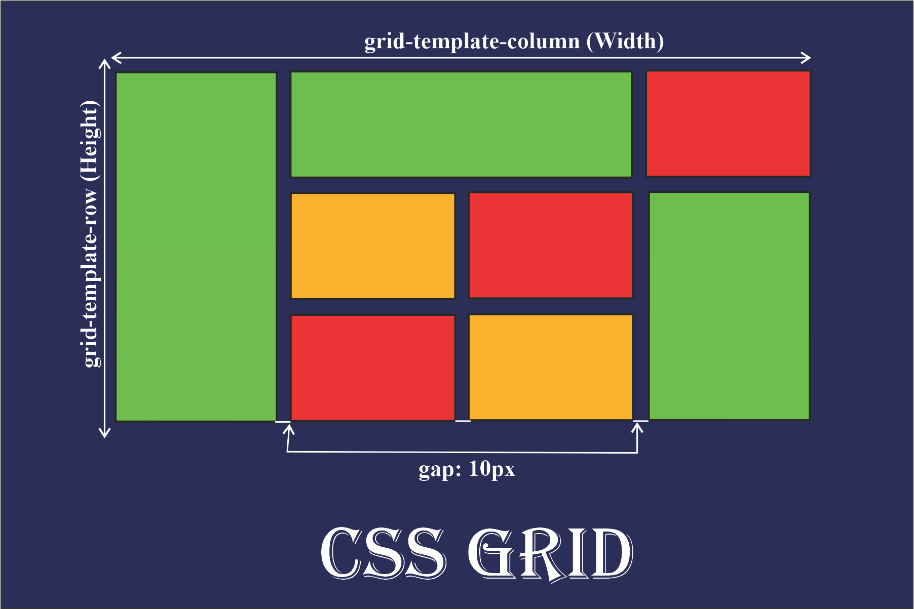
Key Concepts:
Grid Container: The parent element, which is defined by setting
display: grid.Grid Items: The children of a grid container, which are placed into grid cells.
Grid Template Columns/Rows: Defines the number and size of columns and rows.
Grid Gap: Specifies the spacing between grid items.
Example: Simple Two-Column Layout with Grid
.container {
  display: grid;
  grid-template-columns: 1fr 1fr; /* Two equal-width columns */
  gap: 20px; /* Add space between items */
}

.item {
  background-color: lightgrey;
  padding: 20px;
}
<div class="container">
  <div class="item">Column 1</div>
  <div class="item">Column 2</div>
</div>

In this example, the .container defines a grid with two equal-width columns. The gap property ensures that there is space between the two columns.
Flexbox vs. Grid: A Simple Comparison
To further understand the difference between Flexbox and Grid, let’s compare them in the context of a simple two-column layout:
| Feature | Flexbox | Grid |
| Layout Type | One-dimensional (row or column) | Two-dimensional (rows and columns) |
| Alignment | Aligns items along main and cross axes | Aligns items along rows and columns |
| Flexibility | Items can grow, shrink, and wrap | Items placed precisely within the grid |
| Use Cases | Smaller-scale layouts (e.g., navigation bars, card layouts) | Larger-scale layouts (e.g., entire web pages, dashboards) |
| Control | Less control over complex layouts | More control over complex layouts |
| Learning Curve | Easier to learn and implement | More complex, steeper learning curve |
Flexbox is best suited for layouts that require alignment or distribution of items in a single direction (either horizontally or vertically). It’s straightforward and works well when you have fewer layout requirements.
CSS Grid is more powerful for complex layouts. If you want to create multi-row and multi-column layouts with precise control, Grid is the right choice. It allows you to easily handle both the rows and columns simultaneously, offering more flexibility in terms of spatial arrangement.
When to Use Flexbox vs. Grid
Use Flexbox:
For one-dimensional layouts (either rows or columns).
When you need to distribute space between items in a container.
To align items or create flexible layouts with smaller, simpler components.
Use Grid:
For two-dimensional layouts (both rows and columns).
When creating more complex layouts with specific control over both the horizontal and vertical axes.
When designing responsive grids that adapt to different screen sizes.
Resources
Checkout more resources to have better understanding.
Tricks and short: CSS Tricks with cheatsheets to upskill🚀
Mdn: Guide
Conclusion
Both Flexbox and Grid are excellent tools in a web developer’s toolkit. While Flexbox excels at simple, one-dimensional layouts, CSS Grid offers a more robust solution for complex, two-dimensional designs. By understanding the strengths of each system and applying them where appropriate, you can create responsive, well-aligned layouts that look great on all devices.